Alternating boxes
Creating a responsive checker-board layout using :nth-child
After discussing an idea for a simple website with one of my design colleagues the other day I took it on myself to try and build a demo of the layout we were discussing. The idea seemed simple: a responsive grid with alternating coloured sections in a checker-board pattern. Sounds easy right…
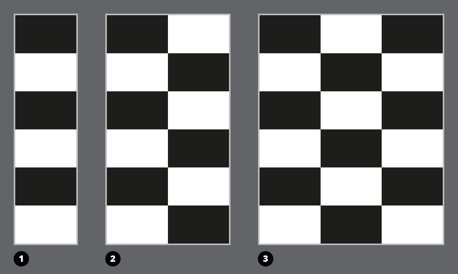
1) Mobile first - single column. 2) Two column alternating sections. 3) Three column checker-board.
Markup
I wanted to keep the markup pretty clean so I used a series of <section> elements and gave each an internal content container. The number of sections would not be fixed.
HTML
<!doctype html>
<html lang="en">
<head>
    <meta charset="utf-8">
    <meta name="viewport" content="width=device-width,initial-scale=1">
    <title>Alternating boxes</title>
</head>
<body>

    <div class="container">

        <section>
            <div class="section-content">
                <h1>Section 1</h1>
            </div>
        </section>

        <section>
            <div class="section-content">
                <h1>Section 2</h1>
            </div>
        </section>

        <section>
            <div class="section-content">
                <h1>Section 3</h1>
            </div>
        </section>

        <section>
            <div class="section-content">
                <h1>Section 4</h1>
            </div>
        </section>

        <section>
            <div class="section-content">
                <h1>Section 5</h1>
            </div>
        </section>

        <section>
            <div class="section-content">
                <h1>Section 6</h1>
            </div>
        </section>

        ...

    </div>

</body>
</html>
Mobile first
To make the single column layout I just stacked the sections and gave them a fixed height. I used :nth-child(odd) to change the background and foreground colours of every other section.
I started using flexbox layout with the align-items: center; declaration to align the section content vertically.
CSS
    .container {
        display: flex;
        flex-flow: row wrap;
        width: 100%;
    }

    section {
        align-items: center;
        background-color: #EEE;
        box-sizing: border-box;
        display: flex;
        height: 300px;
        width: 100%;
    }

    section:nth-child(odd) {
        background-color: #111;
        color: #EEE;
    }
Flexbox columns
Things start to get interesting when using flexbox to flow content into columns. The flex-flow: row wrap; declaration on the container makes the sections flow into columns depending on how wide each one is. Setting the section width to 100% means they take up the full available width and won’t wrap. 50% wide sections wrap into a two column grid, 33.33333% makes three columns, 25% four and 20% five.
I added the section widths inside media queries at breakpoints that felt natural. There's no point getting all anal about choosing breakpoints based on device screen sizes. I always use the content as a guide.
As the source order of the sections stays the same the content flows left to right and wraps down to the next row. I needed to override the :nth-child(odd) style rules so I used a more specific selector to reset the colour changes and set the new widths.
Flexbox Columns
    @media screen and (min-width: 450px) {

        section:nth-child(1n) {
            background-color: #EEE;
            color: #111;
            width: 50%;
        }

        section:nth-child(4n+1),
        section:nth-child(4n+4) {
            background-color: #111;
            color: #EEE;
        }
    }
Alternating boxes
In one column the black then white, odd/even CSS is straight forward. In two columns every first and every fourth section needs to be black. I used a pair of :nth-child selectors to set this pattern.
In three columns only the odd numbered sections need to be black so I went back to using :nth-child(odd). In four columns the maths is a little more complex. Every 1st, 3rd, 6th and 8th section is black.
Four Columns
    @media screen and (min-width: 1350px) {

        section:nth-child(1n) {
            background-color: #EEE;
            color: #111;
            width: 25%;
        }

        section:nth-child(8n+1),
        section:nth-child(8n+3),
        section:nth-child(8n+6),
        section:nth-child(8n+8) {
            background-color: #111;
            color: #EEE;
        }
    }
What seemed to be a simple layout proved to be a lot more challenging than I first thought. You can see the finished result - with responsive styling for one to five columns on codepen.